
🎉 Home
CUSTOMIZE A TEMPLATE ⏱
LEARN VOLTAPP
Voltapp allows you to create an infinite number of different interfaces thanks to a powerful system directly inspired by "flexboxes" in CSS. Indeed, it is possible to define the size and position of elements so that they adapt automatically according to their content, the size of the screen and other elements.
The Disposition component, present on most visual nodes, allows you to define the space taken by the node. We'll also see below how this space can be affected by the parent Section node.
The width and height attributes are used to influence the size of the node. By default they are in "fit" mode, i.e. determined by the content of the node or the parent node. For example, in the case of a text node, the size will correspond to the size taken by the text itself or will be deduced from the attributes of the parent.

Here width and height are in "fit" mode, so the size of the node corresponds exactly to the space taken by the text.
It is also possible to specify an arbitrary size in pixels. In this case, it is the content that will adapt to the space in which it is constrained.

Here we specify a width of 100px for the Text node, so the content of the node adapts to meet this constraint.
You can also specify sizes in percentages. The percentage is a ratio to the size of the parent node. For example, if the width of the parent node is 200px, then if the width of the node is 50%, it will be 100px. The advantage of this technique is that the size can be dynamically adjusted for different screen and window sizes.

Here we see that no matter how big the window is, the text node is always 50% of its size.
Finally the last possible size unit is "range", this allows to specify a minimum and maximum size in addition, the latter can have the same units as above.

As you can see the node has a width of 500px but when the width becomes less than 500px, the node resizes to never be more than 80%.

Margins (internal and external) define the spacing between the contents of the node and its surroundings. Internal margins add spacing inside the node, while external margins push the nodes around to apply the necessary spacing. It is possible to change all the margins at once, or to specify top, right, bottom and left independently.

In this example, the node has an internal margin of 20px.
The hide option allows the node to disappear from the visual rendering. This option can be very useful in combination with a graph, as it allows you to make a node appear and disappear depending on various conditions.
TODO: example
The enlarge and shrink attributes provide another way to specify the size of a node. They are usually used in conjunction with a parent node of type Section. We'll explain in more detail how to use them when we talk about the Section node.
The Section node is probably the one you will use the most in Voltapp. It allows you to define how to place different nodes in relation to each other by combining multiple nodes into a tree structure. The idea of a Section node is to define how to place its children nodes in relation to each other. Rather than giving a hard size, the idea is to provide a set of constraints that allow the nodes to best fit into the available space.
The first thing to know is that sections use a system of axes to define their constraints: the primary axis, corresponding to the direction in which the child nodes are arranged, and the secondary axis, perpendicular to it.

The Direction attribute is used to define which direction the child nodes are placed in the section. They are placed either vertically or horizontally.

It is possible to create more complex layouts by creating a tree structure containing several sections:

The Align attribute is used to define how child nodes are aligned on the secondary axis. They can either be aligned at the beginning, end, center or take up as much space as possible from beginning to end.
.gif)
The Distribute attribute defines how the child nodes are distributed on the main axis.
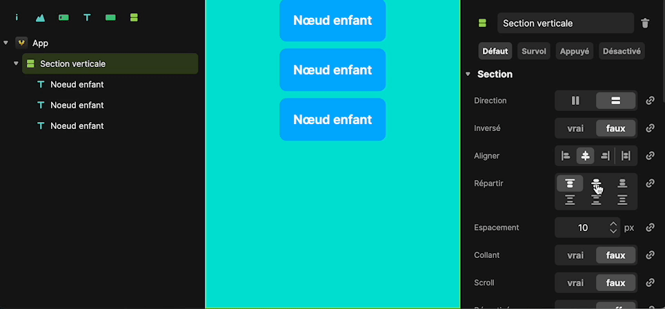
The Spacing attribute works much like the External Margins of each node, but instead of specifying the spacing on each child node, we'll be able to specify a uniform spacing between each node on the main axis. By default, this spacing is 10px.
.gif)
The Scroll attribute allows to tell the Section to scroll inside if the content exceeds the size suggested by the constraints.

In this example Scrolling Section has a hard size of 200px by 200px, by default the child nodes overflow because they have a cumulative height greater than 200px. If we set the scroll attribute to "true", we can scroll within the Section rather than have the child nodes overflow.
This attribute allows you to make sure that a child node always remains visible on the screen when scrolling through a parent node. This attribute is particularly useful, for example, when you want to keep a search bar displayed on the screen when scrolling through an image gallery.

In this example we set the Sticky attribute to "true" on the Search section node so that the search bar stays stuck on top when scrolling through the gallery.
The Expand and Shrink attributes of the Layout component are used to define how much space the node should take up relative to its parent on the main axis. Instead of defining a width or height, you can use the enlarge attribute to make the node expand to the maximum extent possible given the remaining space.

In this example, the top node is 200px high and the bottom node is 30%. By setting Magnify to "yes", the middle node will adjust to take up as much of the remaining space as possible.
If there are multiple nodes with Expand at "yes", they share the space equally.

In this example all the nodes have the Magnify attribute set to "yes", so they all have an equal size on the main axis.
If the attribute Enlarge allows the node to grow according to the remaining space, Shrink allows it to shrink, i.e. to take less space than initially planned.